The Tamesis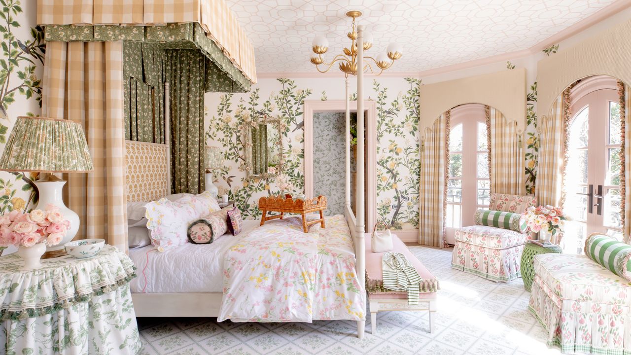
Say what you will about the Victorian Era, but no one can deny that they mastered the art of pattern play. For the elite, “having one wallpaper in a room isn’t enough,” says Annie Elliott, an interior designer and author in Washington, D.C. Instead, the Victorians “commonly installed a sheet of paper on the lower portion of a wall or wainscoting; another sheet above that; and a wallpaper border below crown molding.” Bonus points for wallpapering the ceiling, too.
Of course, this eventually leads to wallpaper fatigue and, in extreme cases, death. “Most wallpaper at the time, including fabric, was made from arsenic,” Elliott explains. “I think there are worse ways to go.”
Design experts now say Bury Me in Wallpaper proves that what’s old is new again.
“Today’s wallpaper is less about uniformity and more about artistry,” says Houston interior designer Paloma Contreras. “Using multiple wallpapers allows you to create dimension and nuance in a way that a single pattern often can’t.”
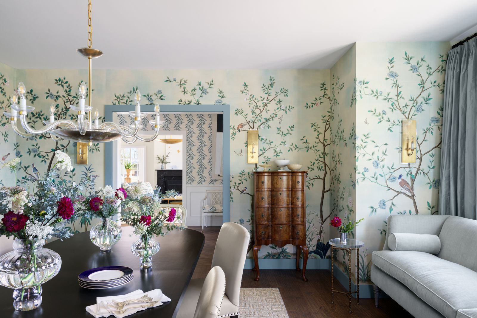
In a recent West Texas project, Contreras paired soft, traditional Chinese accents in the dining room with graphics and structured paper in the entryway to create contrast without feeling disjointed. Shared color palettes and similar levels of formality ensure the patterns feel related rather than competing.
“Architectural transitions, such as doorways or millwork, are ideal places to introduce a second mode because they naturally frame transitions,” she says. “In the 1980s and 1990s, wallpaper combinations were often more strictly demarcated, such as chair rails, and the contrast felt very sharp. Today, instead of creating strong breaks, we seek to create an organic, soft transition.”
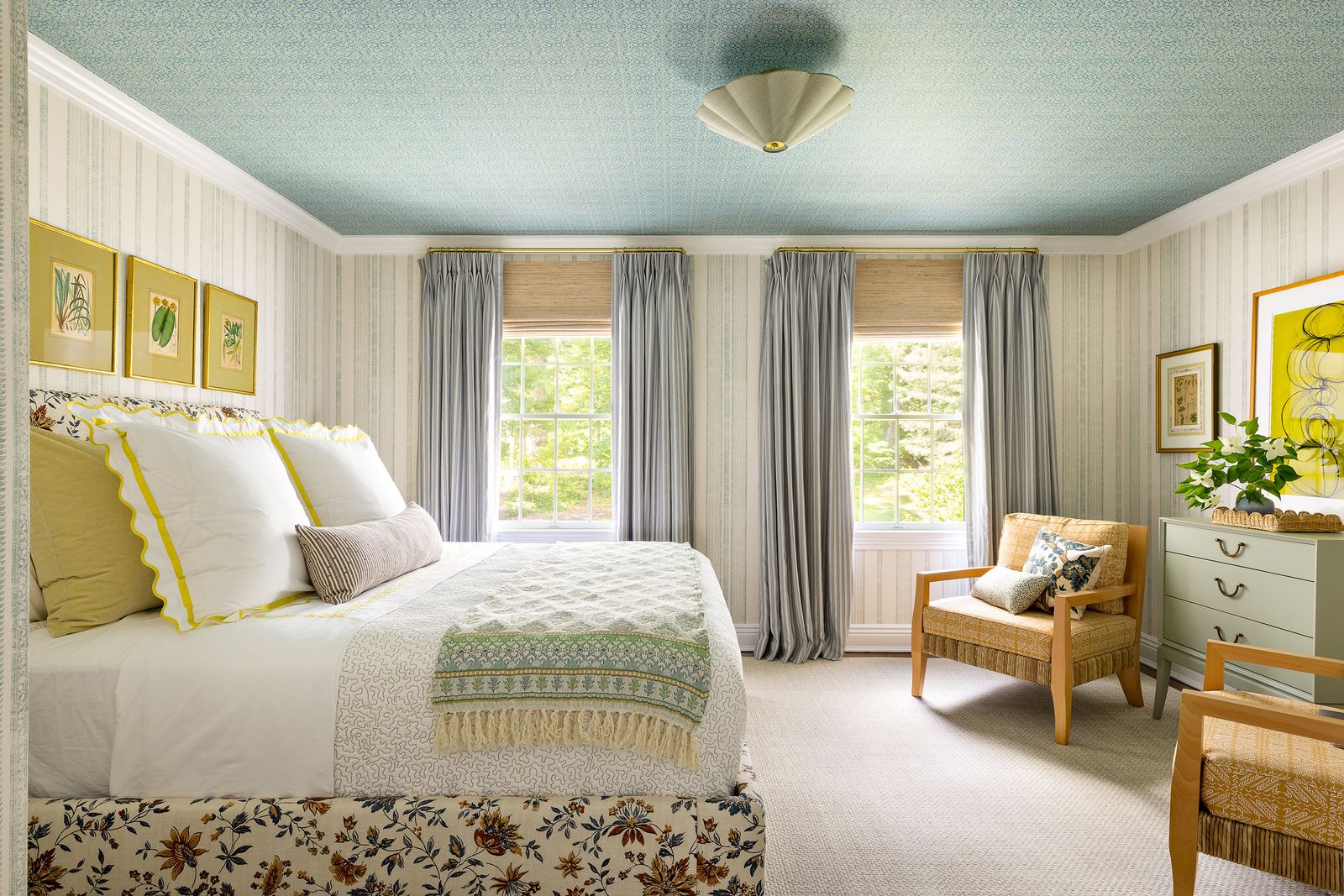
In a guest room in Oyster Bay, New York interior designer Ariel Okin used two different Schuyler Samperton wallpapers to make the space feel “comfortable, layered, and eclectic bohemian, but without screaming too much with garish patterns or hues,” she says.